
Optimizing Payment Portal Accessibility for Seniors: UX Audit
Company : Ingleside
Platform : PersonaPay
Client : RevSpring
Timeline : 13 weeks
My Role (as a UX Designer) : UX audits, Accessibility and Usability evaluation, Recommendations delivery, Vendor communication
Team : Sole designer, Liz Keller (Resident Technology Engagement Manager)
Tools Used : Wave, AccessibleWeb, FigJam, Figma, SurveyMonkey
Introduction: Ingleside wanted actionable suggestions to enhance their payment portal- PersonaPay's compliance with WCAG guidelines and improve accessibility for their primary users - older adult residents. They aimed to present these proposed improvements to RevSpring, the third-party B2B vendor responsible for managing their PersonaPay system.
Context (The problem)
The team observed a rise in accessibility complaints from older residents regarding the newly launched PersonaPay payment portal, along with an increase in time-consuming issue resolution requests to the technical team.
Solution (before we dive in)
Proposed actionable design and development improvements to enhance Personapay's accessibility for older adults
How did I achieve it?
I identified user problems through direct feedback and validated these with insights from accessibility and heuristic evaluations. I analyzed compliance with WCAG, Section 508, and ADA standards using a mix of manual and semi- automated accessibility evaluation tools. Issues were prioritized based on severity and frequency to ensure effective hand-off.
⚠️ The buttons are difficult to see
⚠️ I can't use zoom-in or out

⚠️ My screen reader is unable to read few things
🚨 IT tickets raised : 256
What are Ingleside's project Goals? 🎯
Methods used : Stakeholder interview, Background Research, Cross - team critiques
What does success look like for this project?
1
Reduce accessibility issues + complaints
2
Boost user satisfaction with the new payment system
3
Increase new platform's engagement
(recent shift to paperless billing)
Why do we need "accessibility audit" for this Project?
Methods used : User Survey, Data Analysis
1350
~
~
31%
Total users are older residents aged 65+
of users use assistive devices for digital navigation
3 Key takeaways from user surveys-
✅ Previous surveys revealed that every 1 in 3 of PersonaPay users use assistive technology primarily assistive keyboards, screen readers etc.
✅ The new survey showed that 9 out of 11 users feel PersonaPay is inaccessible with assistive devices
✅ And the most interacted user flows on PersonaPay are for making payments and browsing account activity
The data reveals that despite significant use of assistive technology among PersonaPay users, the majority find the service inaccessible, especially for key functions like payments and account activity.
Given the significant number of users relying on assistive technology, my team and I decided to prioritize enhancing digital accessibility of PersonaPay
Step 1 to enhancing accessibility? ✅"Accessibility Audit"
How am I qualified to conduct an Accessibility Audit?
The course I took in Spring 2024 during my Master's, SP24: EXPR DESIGN & EVAL ACCESS TECH (21401), proved to be crucial for my internship. It taught me about WCAG guidelines and the POUR principles of accessibility, plus how to use tools like WAVE to evaluate websites. My passion for accessibility helped me score 99.84% (A+) in the course, which prepared me to find and fix accessibility issues during my internship.
Additionally, my background in web development helped me understand development issues in the code, such as ARIA, which are specifically related to the digital accessibility of websites. This knowledge allowed me to suggest improvements based on both my personal expertise and online resources.
🤔 But, I realized what I lacked was the ability to report and advocate for accessibility issues, which was essential for the internship.
So, to build on this knowledge
I completed a Digital accessibility foundations course provided by W3C school and additional resources like Deque university, to learn more about WCAG 2.1 guidelines and learning to improve and advocate for accessibility.
Starting the Audit, another challenge arose-
Due to the summer holidays, it was hard to get residents for interview sessions. So, I decided to join a support group’s🧑🤝🧑 monthly meetings at Ingleside with 7 low-vision and age-impaired residents (aged 70+). After talking with my manager, I participated to conduct a focus group call to hear their concerns.
The questions revolved around understanding-
-
What accessibility challenges do the residents face with technology on a daily basis?
-
How confident do they feel in understanding and using any digital technology? What are their frustration?
-
Which interface do they use for PersonaPay- web or mobile?
-
What are the specific frustrations or accessibility concerns they face while using the portal? (including a walkthrough)
-
What improvements do they expect from the portal to enhance their interactions?
Talking to users revealed that
Methods used : Focus groups, Data Analysis, Persona

"It is difficult to use keyboard as I can't see a few keys"
- Anonymous, Age: 86 years
"I use color contrast for almost everything. Blue background and white text"
- Anonymous, Age: 74 years
"I use a magnifying glass to read text on computer"
- Anonymous, Age: 83 years

We identified many user problems in terms of usability and accessibility, specifically the 2 main pain points of residents for PersonaPay were in terms of Readability and Compatibility-
Bigger Problem
Digital Accessibility
Usability
👁️
Readability
💻
Compatilbility
Readability of the portal, including concerns like font size, weight and distinction of buttons were some of the prominent issues
Concerns about the portal's compatibility with screen readers and keyboard accessibility were also significant issues.
+
After receiving feedback on the research from the Technology Engagement Manager and Chief Information Officer, I prioritized the opportunity areas that align best with our strategic goals 🎯.
Prioritized Opportunity Areas
UX Goal
How might we enhance PersonaPay’s readability and compatibility for older adults using assistive devices while ensuring compliance with WCAG standards?
Business Goal
How might we reduce user complaints and support requests while boosting engagement with PersonaPay’s paperless billing system?
Methodology that I used
1
Identify issues
For user accessibility
2
Classify issues
For better grouping
3
Prioritize issues
For smooth hand-off
Identification of issues


View workspace (FigJam Board) - 📌 https://www.figma.com/board/ngleside-X-PersonaPay-
Finding Accessibility Issues
Methods used : Accessibility evaluation, WCAG testing, Issue prioritization
Compliance to-
📖
+
W3C’s Web Content Accessibility Guidelines (WCAG) 2.1, Conformance Level AA
⚖️
+
US federal law Section 508 Compliance
📜
Americans with Disabilities Act (ADA) Compliance
As per our research we identified most interacted user flows as - making the payment and browsing user activity
Identifying accessibility Issues
We conducted WCAG audits accessibility evaluation tools like WAVE and RAMP- Accessible web


🤔 But are just tools enough?
During our testing, I realized that using just tools might not be enough. I needed to show some contextual testing as well to solidify my findings. So I incorporated manual accessibility evaluation along with the semi-automated tools.
Let's take an example to understand the Process
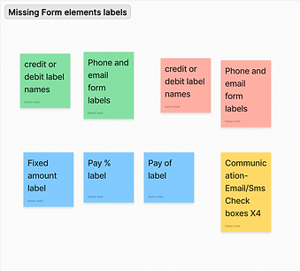
Issue- Missing Form element Labels
Critical
The problem is that the email and phone input fields are not correctly labeled, and the broken ARIA references could further contribute to these issues.
Without a label, screen readers cannot announce what the text box is for, making it difficult for users to understand its purpose and interact with it.

Iteration 1- Accessibility evaluation tool testing (Wave)
We conducted accessibility testing using the WAVE tool which showed the Empty form label issue for the email and phone input boxes.

Iteration 2- Accessibility evaluation tool testing (Accessible Web)
We found the same issue when the other tool- Accessible Web was used for evaluation

Iteration 3- Manual testing to validate
To solidify the evaluation findings, I manually tested the page with Apple's in-built screen reader- "VoiceOver".

🧐 Where is the issue? Aha! I identified the issue through manual testing by inspecting the page's backend code. What I discovered was that the lack of specified aria-labelledby, aria-label, and title attributes was affecting the elements and the screen reader functionality. These attributes are essential for providing accessible content, allowing screen reader users to understand the purpose of the elements.

This was the process I followed for each issue: testing and identifying the source of the problem to suggest developmental changes that could improve the accessibility of PersonaPay
🤔 How to judge the severity of issues?
Most of the issues were development specific issues, this is where the engineers were consulted for prioritizing along with online WCAG documentation to study the severity of the issue.
Metrics that engineering team communicated to classify issues-
1. WCAG Conformance Level (A, AA, AAA)
2. Severity of User Impact, Number of Affected Users/Disability Groups
3. Prevalence of the issue
4. Complexity and Effort of Remediation
Through this cross-functional communication, we were able to prioritize issues and represent in a visual in a visual format-

Out of 124 issue instances, 32% issue instances are high priority, here's why-
These issues have a critical user impact and are of “High severity” according to WCAG standards, with a “High occurrence” rate on the portal. Fixing these issues should be the utmost priority to ensure legal compliance.
Design Issue - Insufficient color contrast on multiple input boxes 🔺22 instances
WCAG 2.1 requires a contrast ratio of at least 3:1 for graphics and user interface components (such as form input borders).


🧑🤝🧑 Impacted user group - older residents with low vision/color blindness
Hard to differentiate between input fields, leading to confusion and errors while filling out forms.
User Impact: Serious (32.3% of individuals with age-related macular degeneration (AMD) experience reduced contrast sensitivity)
Serious violation of Guidelines: WCAG 2.1 (AA), Success Criterion 1.4.11 (Non-text Contrast)
Due to vendor privacy reasons, all issues are not documented. For further information contact kasjoshi@iu.edu
Heuristic Evaluation
Methods used : Heuristic evaluation, Issue prioritization
Identified heuristic issues on PersonaPay using Jakob Nielsen's 10 general principles for interaction design
Prioritized the issues based on their
🤯 Impact - Severity rating of issues,
🥱 Frequency- Occurrence of issues and
🧐 Persistence- Options of alternatives
Sneak peak of High Priority Issue-
Missing confirmation pop-up before completing the payment.
Interface – Web, Mobile
Heuristics violated- User Control and Freedom, Error Prevention, Help Users Recognize, Diagnose, and Recover from Errors, Visibility of System Status


❌ No Intermediate confirmation
❌ Absense of Cognitive Friction
❌ Leads to confusion and potential errors especially for older adults with cognitive disabilities.
Design suggestion – Add a confirmation pop-up before completing payments to prevent accidental actions. This ensures users can review and confirm their transactions, reducing mistakes and enhancing user confidence.
✅ Clear signifier to complete the action or prevent accidental mistake
✅ Enhanced user control
Profile Button Lacks Visual Emphasis
Interface – Web, Mobile
Heuristics violated- Recognition Rather than Recall, Match Between the System and the Real World

❌ Lack of clear differentiation- button
❌ Lack of intuitive icons
❌ Leads to frustration for older adults when trying to access their personal account information
Design suggestion – Improving the button's visibility would make it easier for them to locate and use their profile settings. This can be done by having borders and distinguishable button fill to identify it can be clicked.
)%20(Presentation%20(169)).png)
✅ Increased button visibility
✅ Enhanced distinction
View all the detected heuristic issues and suggested improvements - 📄 Heuristic evaluation document
For efficient hand-off to RevSpring's developers, I created a log to view all issues in one place for efficient tracking of improvements

Since it was a 10-week internship, the scope was limited to conducting an audit rather than a redesign. However, I aimed to provide actionable recommendations that could guide future improvements.
🚩 Persuading the vendor, but how?
One of the more challenging aspects of this project was that, as a designer, I not only had to identify improvements but also persuade the third-party B2B vendor - RevSpring to implement changes for the PersonaPay portal, which is specifically for Ingleside residents.
Solution argument 1
So to improve my case as an accessibility advocate, I presented why these issues are critical to be fixed. I emphasized the importance of legal compliance and the potential lawsuit risks associated with inadequate digital accessibility.
⚖️ Legal Compliance
The Department of Justice (DOJ), the primary federal government agency responsible for enforcing the ADA, has taken the position that Title III applies to all public-facing websites - including places of lodging used by companies that otherwise qualify as places of public accommodation.
🚨 Lawsuit risk
If your website is found not to be fully conformant with WCAG at AA level, you can face significant legal recourse, including costly lawsuits
Web accessibility lawsuits under the ADA are on the rise, with 4,605 web accessibility lawsuits being filed in 2023, marking a 42% increase compared to 2022
Overall usability
User retention rate
Customer satisfaction
Engagement Rate
Solution argument 2
Moreover, to build a stronger case, I identified the metrics that would affect RevSpring the most: engagement rate, retention rate, and customer satisfaction scores. I persuaded them in terms of these metrics by demonstrating how accessibility improvements would enhance them, highlighting the potential for increased user loyalty and overall platform success.
✨ Overall,
Working with Ingleside was an incredible experience. I gained hands-on experience with accessibility audits and had the opportunity to also collaborate with a cross-functional team of managers and engineers over the course of project. Ingleside’s strong commitment to accessibility advocacy across all its platforms aligned perfectly with the project’s goals.
My contributions were well-received, leading to the continuation of my internship with a new project into Fall 2024.
If I had more time on this project, I would have:
-
Validated the issues with additional experts.
-
Streamlined the hand-off process with potential design solutions.
-
Conducted usability testing sessions with users to identify further issues for redesign.


Thanks for reading
Check out my other projects


You can find me at
If not here, then you can definitely find me petting some dog 🐶